Activity #4 WRITE ABOUT IT!
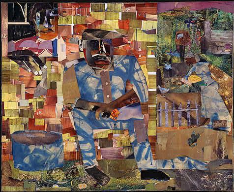
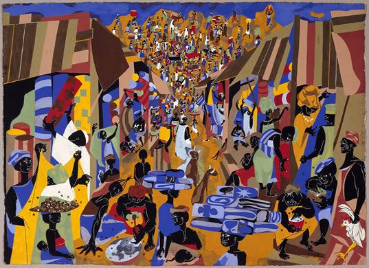
Romare Bearden’s, Tomorrow I May Be Far Away is based on asymmetrical balance. The torn paper, and the use of color throughout the picture provide asymmetry in this painting. Size and placement was used to emphasize the man sitting on the front steps of the house. The focal point are the magazine cut outs used on parts of the face and body of the man and the person standing in the window. Through repetition, visual elements can take on a rhythm within a work. In this painting the colors of the shapes on the house provide the rhythm. magazine picture cutouts, various papers, charcoal, and graphite provide variety in Bearden’s work of art. Romare Bearden's work captures, vivid colors and emotive imagery that characterizes the rhythmical beauty of this painting.
Activity #3 BLOG IT!
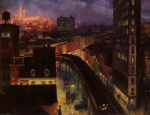
I have always loved the composition of this painting. The contour that the artist gives the women’s bodies, the colors used, all of these things give this painting unity. The focal point is the woman that has her face turned to the side.
Romare Bearden’s, Tomorrow I May Be Far Away is based on asymmetrical balance. The torn paper, and the use of color throughout the picture provide asymmetry in this painting. Size and placement was used to emphasize the man sitting on the front steps of the house. The focal point are the magazine cut outs used on parts of the face and body of the man and the person standing in the window. Through repetition, visual elements can take on a rhythm within a work. In this painting the colors of the shapes on the house provide the rhythm. magazine picture cutouts, various papers, charcoal, and graphite provide variety in Bearden’s work of art. Romare Bearden's work captures, vivid colors and emotive imagery that characterizes the rhythmical beauty of this painting.
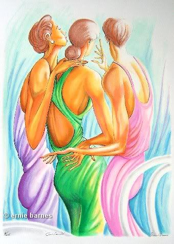
Activity #3 BLOG IT!
I have always loved the composition of this painting. The contour that the artist gives the women’s bodies, the colors used, all of these things give this painting unity. The focal point is the woman that has her face turned to the side.
posted by Deidre @ Thursday, February 16, 2006
0 comments
![]()